WEBSITE REDESIGN
Arvada Adventist Church
ROLE: Researcher & UX Designer

CHALLENGE
The church’s outdated website lacked clarity, consistency, and ownership which led to poor engagement, especially among youth. Leadership wanted a modern, easy-to-manage site to support livestreams, events, volunteer signups, and donations.
DESIGN STRATEGY
I conducted interviews, surveys, and competitive analysis to identify key user needs: easy livestream access, consistent event info, and intuitive navigation. Using card sorting and usability testing, I restructured the site around key actions paired with a mobile-first design and refreshed branding.
OUTCOME
The redesigned site features embedded video, event listings, a clear content structure, and visual improvements. Testing led to stronger CTAs, simplified layout, and added features like prayer request forms and donation points. Final steps included prepping content and assets for development.
FULL CASE STUDY
Arvada Adventist Church is a small church without a staff member to update their website regularly which resulted in it either not functioning or being outdated.
*I’ll shorten Arvada Adventist Church to AA Church.
The site they most recently had designed didn’t update and wasn’t functioning, so they defaulted to an older version of the site just to have something online. As a result there were sections that were completely missing content.
There were also sections with outdated information. Teen Worship & Indonesian Worship are no longer at these times or location.
The leadership wanted to find a website solution that would be low maintenance but also recognized there was a bigger issue to address.
Churches struggle to encourage members to engage beyond weekly Sabbath attendance and gain new members.
In order to serve the community, the church relies on contributions of time (volunteering) and money (tithes & donations) from members to expand their programs and reach.
This puts church growth at risk as time goes by if they cannot reach the next generation. The church leadership wanted to emphasize strategies to engage the young people through digital features on their website.
Across the Adventist Conference young adult and teen attendance is at an all time low.
Surely Arvada Adventist Church wasn’t the only one experiencing these challenges.
COMPETITIVE ANALYSIS
I wanted to see how other churches served their communities through services and programs as well as their online presence.
I conducted a comprehensive competitive analysis of 4 local churches and their websites in the Denver metro area. This included two other Seventh Day Adventist churches: Chapel Haven & New Day as well as two other Christian churches: Grace Church & Red Rocks Church.


I discovered similarities and differences among the churches.
Churches employed different strategies or features to represent themselves online.
CHAPEL HAVEN
Their mission and beliefs are clearly outlined in the about Us section, however the page is very text heavy.
NEW DAY
The homepage utilizes both top level navigation and call to action buttons in the hero section.
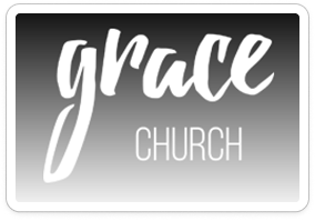
GRACE CHURCH
A sticky banner highlights the live stream of their services. These cards give quick visual access to various programs and offerings.
RED ROCKS CHURCH
This is a clear way to let people know different formats where they can access messages. The most recent message is placed first noting translations that are available and a previous sermon gallery could be found below.
From the competitive analysis, I identified essential content areas for a strong church website.
MISSION & BELIEFS
Visitors expect a clear statement of what the church stands for.
PROGRAMS FOR ALL AGES
Families expect info on kids, youth, and adult groups.
WELCOMING MESSAGE
Churches emphasize that everyone is invited and included.
SUPPORT MINISTRIES
Members want to know where to find care and prayer support.
SERVICE DETAILS
People look for worship times, what to expect, and how to join.
VOLUNTEER OPPORTUNITIES
Clear paths to engage and serve in the church community.
From these core content needs, competitor comparisons reveal specific opportunities for AA Church to stand out.
RESEARCH
THE WHAT
Objectives
Find out why and/or when people come to church.
Discover what people enjoy about church services and/or programs.
Understand what people don’t like about church services and/or programs.
Discover barriers to attending church or programs.
Understand ways that the church can support its members.
THE HOW
Methodologies
Interviews
I conducted 5 interviews with participants from different ages and levels of church involvement, which provided rich qualitative insights into personal motivations, unmet needs, and opportunities for deeper connection.
Survey
I also took a survey to capture a wider range of responses.
THE WHO
Participants
To capture a clear picture of the diverse needs and perspectives within the church community, I included participants who represented contrasting groups as well as overlapping life stages:
Occasional church attendees vs. active volunteers
Newcomers vs. long time members
High school students, young adults, parents
INTERVIEW INSIGHTS
Access to online service videos is a priority for church members and leadership.
Live Stream of Sabbath services as well as past sermons are currently offered on Arvada Adventist Church’s website. You can see that they are utilized by both existing and prospective members.
"If I go in person and my kids have to work, because they work weekends, then we sit at home later and watch the service together.”
-SARAH
“I watched the service online for the first few Sabbaths before attending.”
-AARON
Church members seek calendar or event listings updated in real time.
Members experience frustration when they plan for an event and it gets rescheduled at the last minute.
“If I see an event on a calendar, I want to know that I can count on that. There are a lot of last minute changes.”
-JEREMY
Opportunities to strengthen program visibility and consistency
Members enjoy church programs like Gym Night and Bible study, but many are unaware when they’re happening or wish they were offered more regularly. Clearer promotion and consistent scheduling could help more people participate and stay engaged.
“I have not attended a Gym Night... I didn’t know they had a Gym Night.”
-SARAH
“I do miss the Bible studies we were doing. I’d like to see that get going again.”
-AARON
Church members seek programs for a variety of ages with detailed descriptions and proper promotion.
Tiffany hasn’t gotten involved beyond weekly services because the additional programs don’t serve younger kids and the Women’s program hasn’t piqued her interest due to lack of information.
“We mostly attend on Sunday services. I’m waiting for the kids to be old enough to participate in the summer camp. They have a women’s “Connect” group but it seems kind of vague to me.”
-TIFFANY
PERSONAS
I created three research-based personas and considered their unique perspectives to help guide user needs and goals.
PROBLEM
People struggle with motivation and availability to stay engaged at church.
Balancing church with work, school, and family demands
Few resources to deepen faith beyond weekly services
Unclear or overwhelming paths to volunteer involvement
Inconsistent programs hinder long-term engagement
IDEATION
Empathizing with church members through storyboards shed light on some real life challenges.
One common need of church members is to watch a service when they can’t attend because of work schedules and other commitments.
A common need of newcomers to church is knowing when upcoming events or programs are happening which is challenging when you don’t know many people.
I compared leadership needs from our initial meeting to user needs revealed in the research process to guide project goals.
I determined the following must-have features.
I performed a card sort to help the navigation items match up with Emma’s mental models.
Information on the website could generally be grouped into the following user identified categories.
Watch
Worship & Study
About Us
Get Involved
Get Support
Find Us
SITEMAP
EARLY USER TESTING
By presenting low and mid-fidelity prototypes, I identified how users preferred information to be structured and displayed.
Homepage
Feedback: CTA in carousel was overlooked; users preferred static visibility and card layout
Change: Made CTA permanent and added content cards below hero
Benefit: Key actions always visible; content easier to scan
Watch Page
Feedback: Users disliked clicking away for livestream; liked bold sermon cards
Change: Embedded livestream player; styled past sermons as clickable cards
Benefit: Reduced friction to watch; improved discoverability
I also tested additional mobile screens with users.
Get Involved Page
Feedback: Calendar view was confusing; list view preferred
Change: Replaced calendar with list of upcoming events
Benefit: Faster scanning; clearer planning
Get Support Page
Feedback: Mobile users wanted accordions to see all categories; desktop users fine with cards
Change: Added accordion menus on mobile; kept full cards on desktop
Benefit: Optimized clarity for each device type
A few other sections and elements had some updates applied.
Something for Everyone section
Feedback: Section was popular but lacked meaningful content
Change: Replaced with dedicated New Members Page
Benefit: Consolidated newcomer info; avoided empty sections
CTA Hierarchy
Feedback: Users noted that the “Live Stream” option felt buried in the navigation when placed next to “Worship,” and they wanted it to be more prominent
Change: Elevated “Live Stream” to top nav, brightest color, and sole CTA on mobile
Benefit: Increased visibility and engagement with streaming
BRANDING
I recommended that the logo be refreshed.
Reflection: Original concept had potential but lacked clarity and readability
Change: Created a refined version with simpler typography and cleaner mark
Benefit: Easier to read at small sizes; works consistently across digital and print
I also recommended new color palette for the site.
Reflection: Original purple felt generic and didn’t reflect church identity
Change: Introduced deep teal, light green, gold, and beige
Benefit: Creates a cohesive, welcoming identity across touchpoints
Teal = serenity & stability
Green = growth & renewal
Gold/Beige = warmth & positivity
USABILITY TESTING
To prepare for usability testing, I identified four key tasks based on user needs expressed during the interviews.
Watch live / past sermons
Confirm event dates & times
Access class lesson materials
Submit prayer requests
TASK FLOW
This task flow helped people like Maria submit their requests for support through prayer.
The task flow visualization made submission paths obvious and helped stakeholders align on user journeys.
ITERATIONS OVERVIEW
User testing revealed opportunities to simplify language, surface key actions, and improve accessibility. The table below shows the changes.
DESKTOP PROTOTYPE
The desktop prototype emphasized giving users multiple entry points to key content through navigation, CTA buttons, cards, and links.
This ensured high priority actions were always visible and easy to access during testing.
ITERATION HIGHLIGHTS
Navigation Language
Usability testing showed that terms like “Programs” were vague. I renamed it to “Events & Activities” and simplified the navigation to improve clarity and ease of use.
Navigation Structure
Leadership also wanted mission work to be more visible. I added “Outreach & Missions” to the top nav and moved “Outreach Programs” there, aligning structure with both user expectations and leadership priorities.
Content Accessibility & Resources
Testers expressed a desire for translation options and more context (sermon notes). I added links to translation services and sermon notes beside video content. These adjustments improved accessibility and enriched the experience for viewers online.
MOBILE PROTOTYPE
The mobile prototype focused on efficient use of limited screen space by introducing accordion menus for clarity and easier scanning.
This ensured high priority actions were always visible and easy to access during testing.
ITERATION HIGHLIGHTS
Prayer request / Support Flow
Some participants weren’t sure how much to write in the prayer box or when their need didn’t match preset categories. I added guidance text and an “Other” field to broaden flexibility. On mobile, I repositioned the Support form higher on the page so users could see it without excessive scrolling.
Donations & Mission Engagement
During testing, users suggested making donation options more prominent within mission storytelling. I placed a donation callout directly on the Outreach & Missions page, linking involvement to impact. This fosters deeper connection between mission content and giving actions.
NEXT STEPS
In the final meeting with church leadership, we outlined the remaining tasks to complete before handing designs to a developer.
Refine content to reflect the authentic voice of the church
Develop specific text and media for the Missions section
Replace About Us text with short videos (30–90 seconds)
Swap stock photography for high-quality photos of members and programs
SUMMARY
The redesigned site provides a clear structure to engage members and welcome newcomers.
Church leadership approved the navigation and layout, confirming alignment with both user needs and organizational goals. I prepared the designs for developer handoff and remain available to support future updates as new needs arise.
More Projects

Diversity Corner is a feature addition concept to help community members access titles highlighting diversity & inclusion through the HPLD website.

A mobile app concept for moms that streamlines the process of finding and planning hiking meetups with family and friends to support their health & wellness.